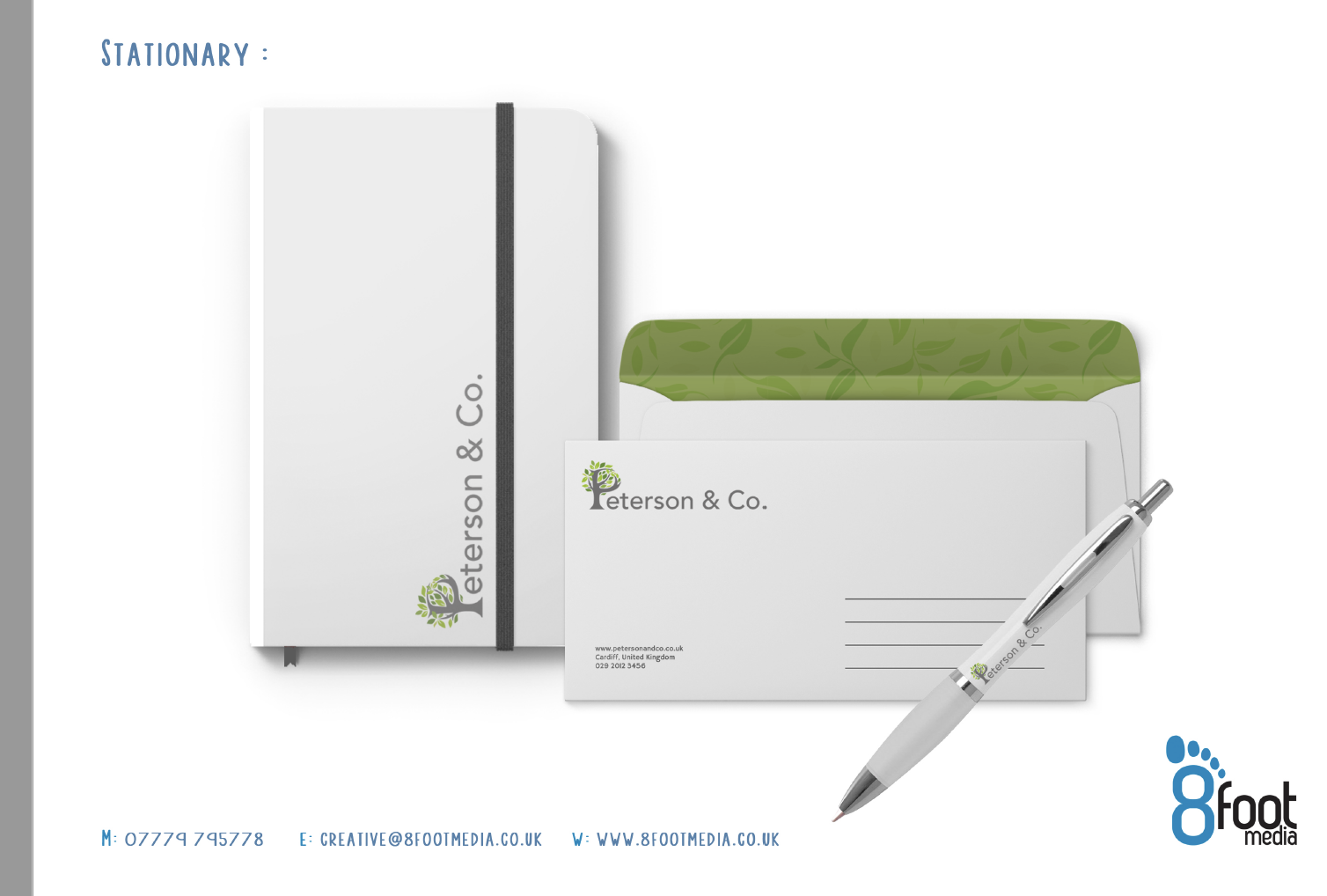
Peterson and Co.
Book keeping service asks Yeti for help with re-brand
We were asked by a book keeping service to help with a re-brand of the business. The first logo had not been done professionally and they wanted something that was future proof when they grew.
We took a brief from the director who wanted to use a tree to symbolise both solidity and growth. The P was turned into a tree and cool corporate colours were used to provide a professional look and feel around the brand identity.
2020-06-18


